Data Visualization makes numbers into beauty.

Data can be a very difficult thing to process and understand. Trying to parse numbers and what they represent and understand their impacts and influence on each other can be near impossible by just looking at a spreadsheet. By taking that and creating visuals, data can be made from an opaque black box into something that can not only be easily understood, but even be considered beautiful.

I've done a number of data visualization projects, this is a sampling of a few of them, ranging from artistic representations, to process maps, to dashboards.

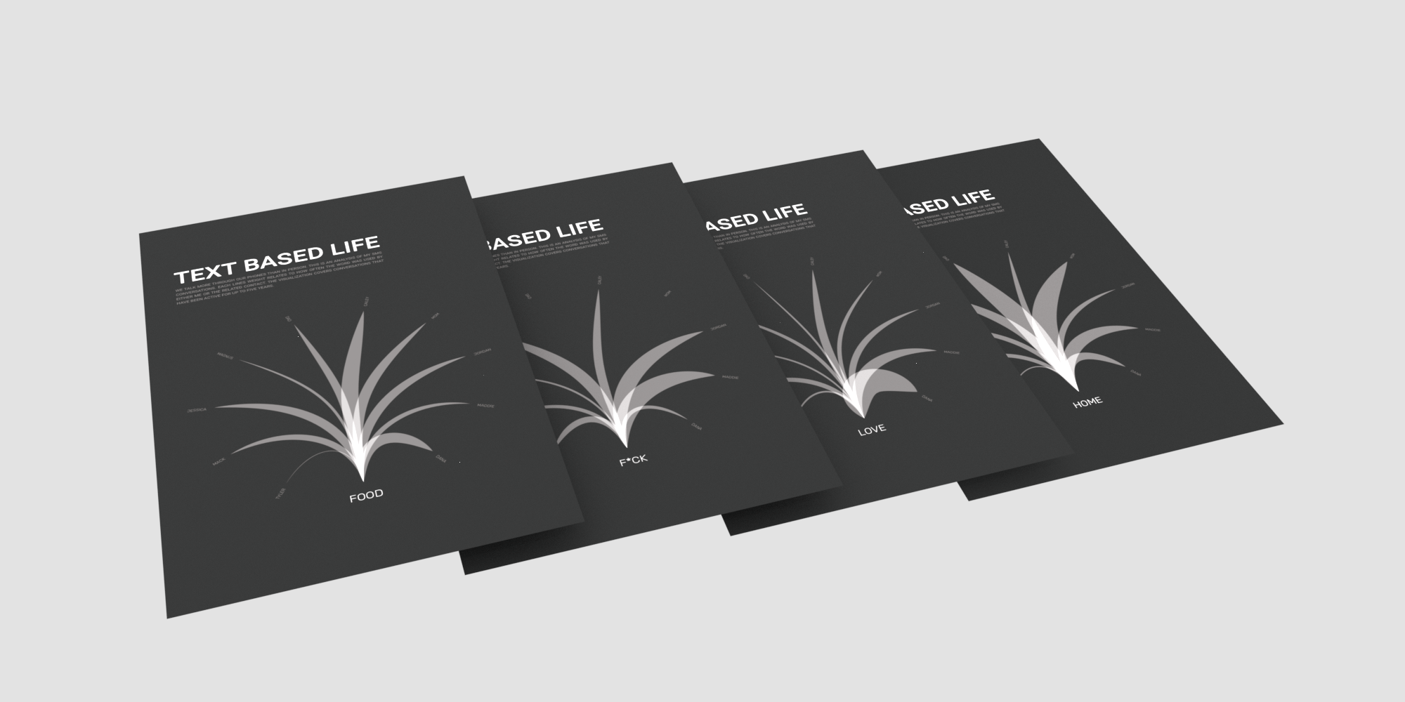
Text Based Life is a look at digital relationships.

This was the first of my forays into more personal data visualization projects, and would later go on to inform Voice in the Data. It is a visualization of how often four keywords appeared in conversations with my 10 most text contacts at the time of its creation in 2018.

It offers a strangely intimite view of my life through such little information. Despite never showing a single message, just knowing how often four words appear can give so much.

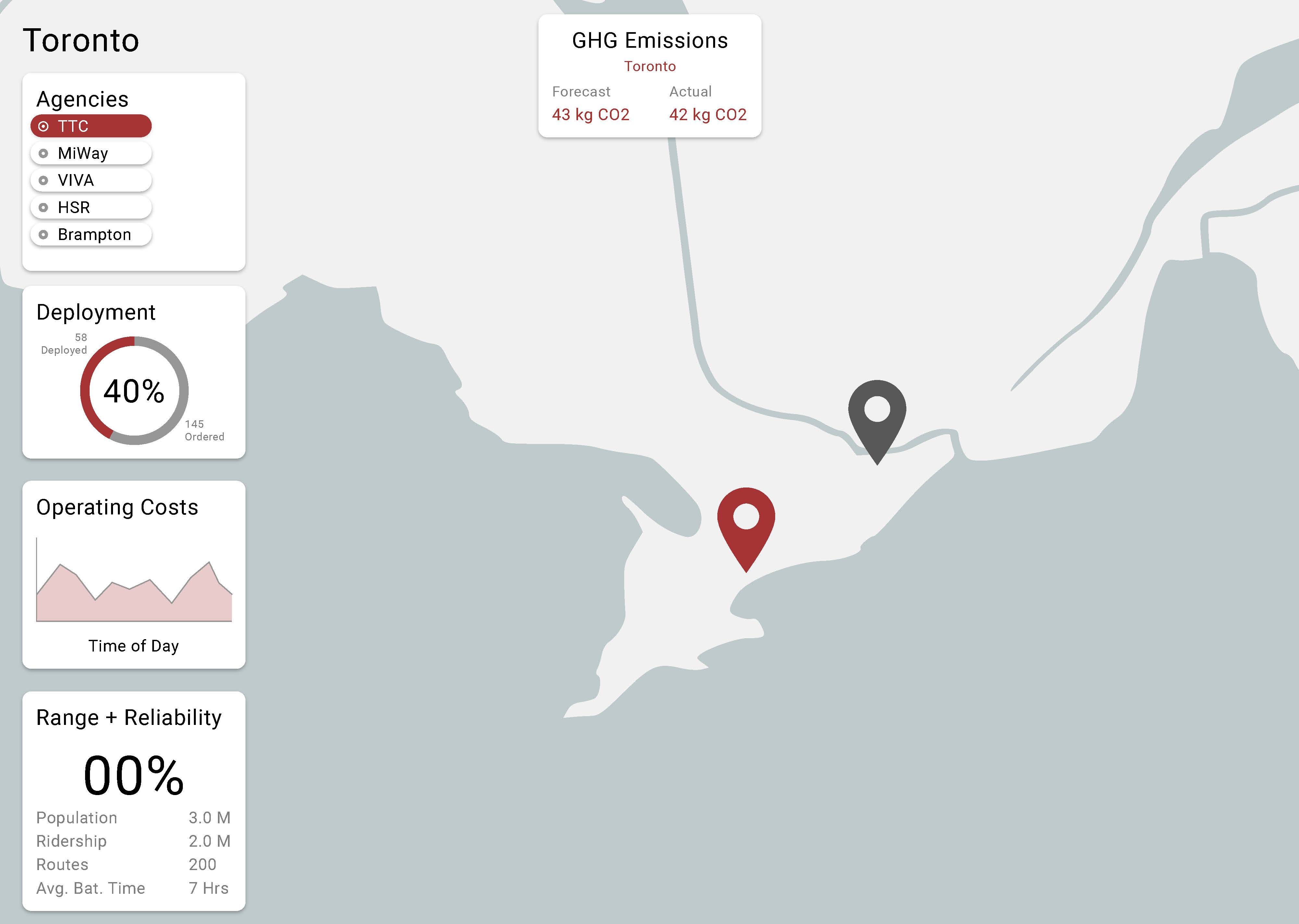
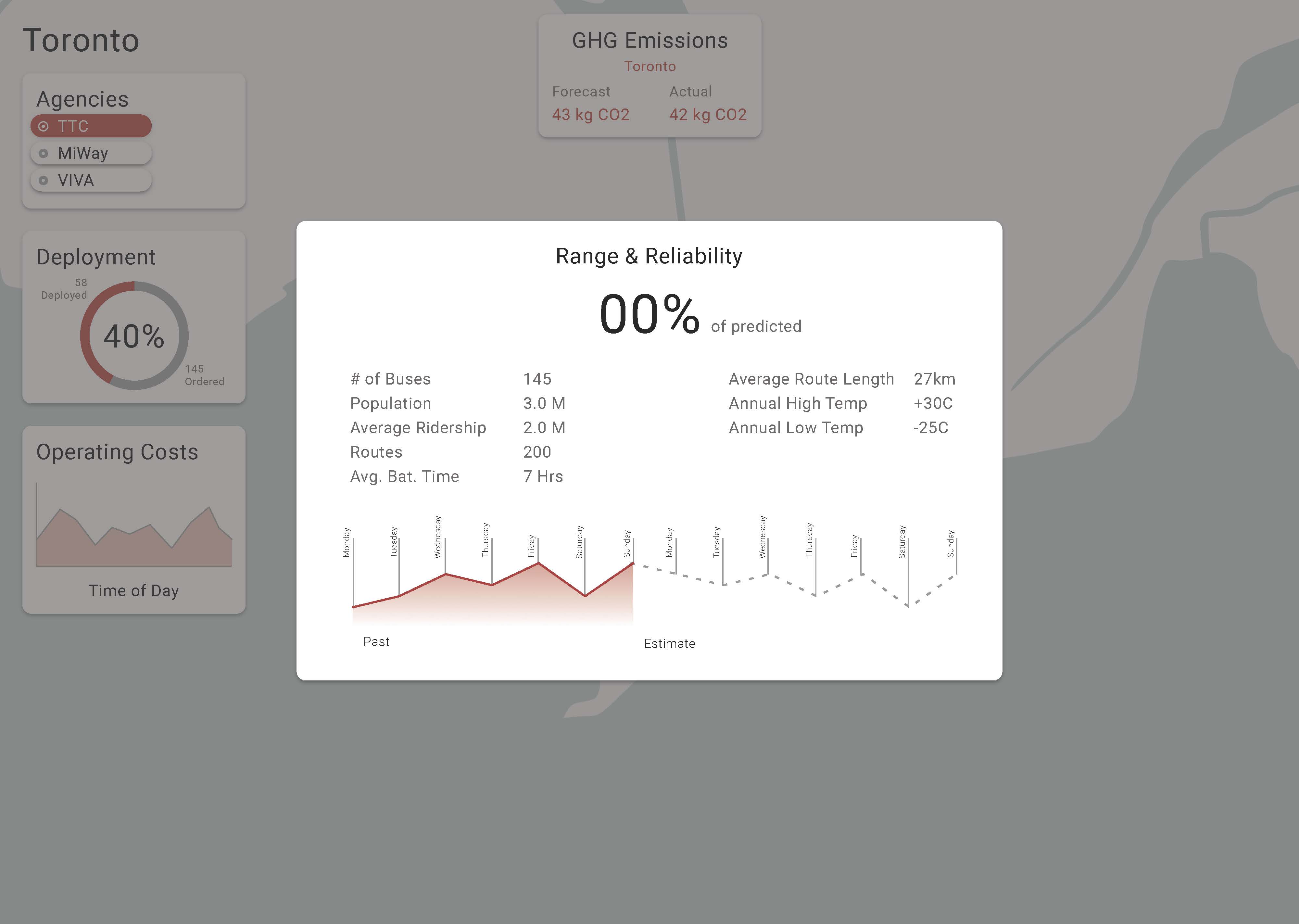
eBus Deployment through a dashboard.

As a part of my work with the Visual Analytics Lab at OCAD University, I was tasked with mocking up a dashboard for monitoring the current progress of the project across the country. The main aim of the dashboard was to be able to compare different cities and transit systems quickly, leading to the choice of a map based dashboard.

Reliability of the network as a whole was chosen over dividing it between electric and conventional buses, as the preference was to compare this with the percentage of deployment.

OGC Process Map

Created during my time at Orange Gate Consulting, the project map was created to help inform both the client and newer employees of the project creation process at the company, and was used for the onboarding of their employees through until my departure from the company.